In the Gray Benko Home design world, neutrals are the enemy.
Instead, the design team behind the television show "Anything But Gray" on Magnolia Network prefers a living room with teal walls next to a foyer drenched in lavender and a butter yellow kitchen accented with a heavily floral print wallpaper.
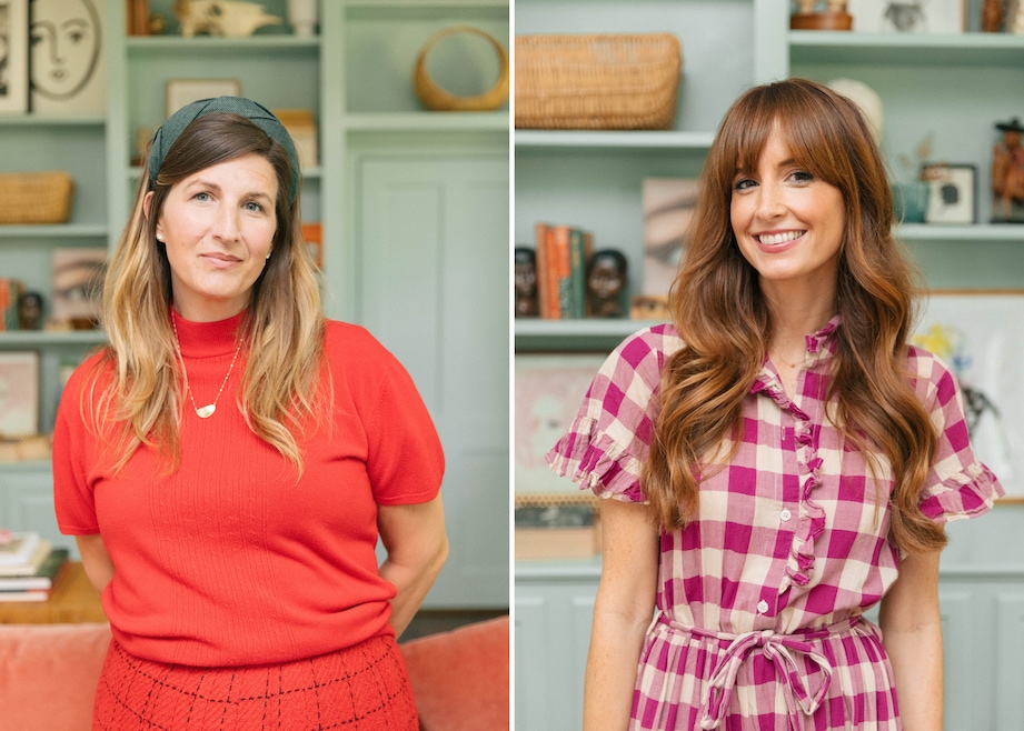
That’s the type of style South Carolina-based Gray Benko Home aims for — something “colorful, eclectic and soulful,” describes co-founder Gray Benko.
It’s a look loved by “fun people,” said Gray Benko Home co-founder and designer Chelcie Eastman. Both Benko and Eastman see the love for bold interiors becoming mainstream — or, returning to its rightful place among design options, depending on who you ask.
“I think for so long, houses have just been lacking any personality,” Benko told Homes.com. “It’s so rewarding to be able to live in a home that feels like a reflection of you and who you are.”
For Eastman, the shift toward white, neutral homes in years past is something she saw as a move away from what’s natural for people.
“I think the gray on white on gray was the fad. … People are just now coming out of a fad and going back to design,” said Eastman, pointing toward the rich colors used in early 17th and 18th-century homes.

The pair’s lively designs previously were featured on HGTV and now have hit TV screens again with the first season of their Magnolia Network show, “Anything But Gray,” walking viewers through how exactly they decide on the shade of teal to spread in a living room or how to balance a floral wallpaper with red striped furniture.
While most of their choices are inspired by clients or based on that innate designer feeling, the pair has a few tricks for expertly curating a color-rich home.
Follow the classic design rules — or don’t
Benko believes rules should be broken. “As long as you’re living in a space that makes you feel happy, that’s all that really matters,” she said.
But if you’re really lost, Eastman’s more of a technical designer, and points toward the 60-30-10 rule for achieving a good balance of color.
The 60-30-10 rule says 60% of a room’s color should be the main, 30% should be the secondary and 10% should be the accent. That’s why an unexpected or juxtaposed color always works, the designers say.
Nowadays, the color-drenching trend throws that all out the window by covering a room head to toe in one hue. But to find equilibrium between several shades, it’s a solid rule of thumb.
The color wheel never hurts, either. Benko and Eastman say selecting a color opposite sides of the wheel for complementary colors or next to each other for an analogous color scheme is a good failsafe.
The designers both love a pop of red everywhere, along with the color combinations:
- Pink and red.
- Pink and brown.
- Red and blue.
- Palladian blue and baby blue ("in a high-lacquer situation," said Eastman).
“Do the basics, and then if you don’t like it, change it,” Eastman said. “Keep being authentically you, and then it will work out.”
Find your hero piece
Using one central piece to design around can make other decisions easier, the designers say. However, the true starting point should be the emotion you want to evoke when in a room and then locate something that exudes that feeling.
“It could be wallpaper, it could be a rug, it could be fabric, it could be whatever,” said Benko.
“It’s the thing you can’t live without, and then you design around it to make sure it works,” added Eastman.
For example, when remodeling a kitchen for the Victorson family, the clients wanted to keep their white kitchen cabinets, so Eastman and Benko used the white from the cabinetry to decide on a wallpaper.
The pair selected a larger blue floral with a white background to ensure the cabinets felt like they belonged in the room. From there, they added a contrasting red and pink striped bench that had a small blue accent to tie back into the wallpaper.
Then, red dining chairs were chosen to tie back to the stripes, and accents of yellow and orange — which sit next to each other and next to red on the color wheel — tied the entire palette together.
Consider the whole home and embrace what’s there
If there’s a fireplace, Eastman says it instantly becomes the focal point of a room. “They need to be designed around,” she said.
In the Victorson home, the designers painted the brick fireplace a red-orange to match the walls.
“Woodwork, trim work and flooring also really set a tone for a room. They’re expensive to put into homes and take a lot of time and energy,” Eastman added. “Picture rails, beautiful judges paneling, big moldings or old heart pine floors. They just have to be a consideration; you don’t cover those things up.”
“If you are in a historic home, it’s okay to keep in mind that not everything should be perfect,” said Benko. “It’s okay to embrace the imperfection because there’s a story there.”
And if one room uses lots of color or has a more maximalist vibe, that should be reflected throughout the home.
“We tell people that if you’re going to do color, it makes sense to at least put some color in every space,” said Benko. “You don’t want to have a colorful living room and everything else is just white.”
“Unfortunately, it can feel like the room standing beside it is unfinished,” added Eastman.
To draw the color throughout the home, the pair suggests painting moldings, trim work or doors.
It’s OK to dip your toe in
Overall, Benko and Eastman say decorating a home will take time, and to enjoy the journey.
Although starting modest and small is not their forte (they prefer “to go big or go home”), dipping a toe into a fun paint color or a single room is a good way to start a project.
“It’s great to start in a bedroom because that’s the only room in the house that’s specifically meant for you,” said Benko.
“If you’re scared, do it in places people aren’t in a lot,” said Eastman. “But I would also say, going big also requires money to be spent. And I want my money to be put where people see it.”
If looking for a small space with high visibility, they suggest a foyer, dining room or powder room. From there, that area can set a tone for the entire house and provide a palette to pull colors from for the rest of the house.
“It doesn’t have to all match, but each space needs to be friends with the next space in some way,” said Benko.