It's only mid-August, but a few paint companies have already announced their colors for 2026.
Green has been the big winner so far. Behr settled on a verdant hue, Valspar a eucalyptus shade and, although it hasn’t announced its pick yet, Sherwin-Williams put out its 48-color forecast — from which it will select its color of the year — with quite a few greens in the deck.
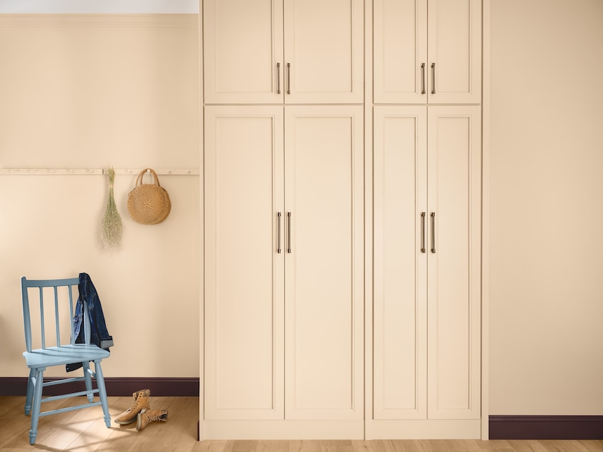
Bucking that trend, Cleveland-headquartered Dutch Boy Paints on Tuesday selected Melodious Ivory, an off-white, for its 2026 pick. With its blushes of peach and yellow, the “inviting neutral speaks to a cultural shift toward simplicity, authenticity and intentional living,” according to the paint brand's announcement.
Amid the continuing popularity of colorful rooms — and the retreat from the cool-toned neutrals of the 2010s — picking a shade of white might seem like an unexpected marketing strategy. But there are reasons for it.
The journey to selecting the 2026 color started roughly a year ago, explained Lisbeth Parada, the company’s color marketing manager. It’s a team effort that involves “researching trends in various different design fields,” she said. This cycle, that research touched on fashion, residential and commercial interiors, architectural projects, consumer purchase trends and technological advances — think, artificial intelligence. All those social and cultural observations get boiled into a forecast from which the “hero color” gets plucked.
“It’s that one color that summarizes all of our trend observations into one hue,” Parada said.
'It’s going to bring a sense of familiarity'
There were four driving influences that nudged Dutch Boy toward Melodious Ivory: nostalgia, off-grid romance, mindful consumption and a return to the basics.
The first two influences lean toward a melancholy for the past, one that wasn’t quite so online. They also nod toward a pervasive societal unease.

“This really stems from the uncertainty of today’s reality,” Parada said. “Our consumers … are seeking comfort in classic design and timeless aesthetics which speak of a bygone era.”
Classic might mean a midcentury ranch for some and a cottage bungalow for others, so the ivory paint was partially selected for its versatility: It’s a backdrop that easily foregrounds “vintage pieces, thrifted pieces and family heirlooms,” Parada said.
That nostalgia also reflects “consumers being drawn into self-sufficient lifestyles inspired by the Old West,” she continued. “And then it gets translated into homestead-inspired aesthetics, so we’ve seen the rise of 'cottagecore.'”
On the flip side, mindful consumption and a return to the basics speak to a pared-back consumer. “Every day it seems like things are getting more and more expensive, and so we’re seeing consumers doing more with less,” Parada said. “And when they are purchasing items, they’re being very cautious. They’re looking at concepts like durability or repair culture.” At the same time, consumers are looking for a versatile background that fosters interaction and connection, something for which Parada said Melodious Ivory, with its warm undertones, is well suited.
“Because Melodious Ivory is a neutral, it has this enduring timelessness to it,” she said. “It’s going to bring a sense of familiarity.”
How to use Melodious Ivory
Like other brands, Dutch Boy Paints promoted its color of the year alongside three palettes and various usages.
The palettes simplify design for customers — they can select a trio of preapproved colors for their project — and show how one color applies to different design aesthetics.
“Melodious Ivory might not be a fit for everyone’s project or everyone’s aesthetic,” Parada said, but when faced with a 1,000-color-plus paint deck and bare walls, the curation offers “a nice starting point for our consumers.”
Parada’s favorite is a palette dubbed “Serendipity,” which pairs Melodious Ivory with a trendy butter color (Simply Yellow) and a light-orange hue (Nice Nectarine).
The combination gives a “pinch of joyful energy” that “allows you to gather with loved ones and celebrate life’s small achievements,” she said. “In our research, and we’ve been seeing this for the last couple of years, younger generations are stepping away from traditional milestones … and leaning more into these small achievements.”
With its warm undertones, the color “fits perfectly for eating and dining areas,” Parada suggested. “It’s a very welcoming color, which makes it perfect for these spaces where we gather around with our friends and families to tell stories.”