When Sue Wadden needs to decompress, she puts on a podcast and paints something in her house.
The project can encompass a room, a vanity, the cabinets. “I just love it,” said Wadden, the Sherwin-Williams director of color marketing. “I think it's such a great way to transform a space.”
Although it’s almost hard to believe that someone who spends her day job thinking about paints and colors goes home and thinks about more paint and colors, Wadden said it's true. Her century-old home has lots of smaller, contained rooms, making the residence ideal for color experimentation: Her dining room, for example, has been red, a deep green (Taiga), a black, and a bronzed black (Sealskin). Now, it’s a creamy off-white (Shoji White) because the space needed a reset.
One color she doesn't use: blue.
“I love blue, but I have a hard time bringing it into my house,” Wadden said. “I don’t know why.” Instead, she said she prefers warmer colors, your nut browns, beiges and khakis — that’s just the way she is.
As she nears 27 years with Sherwin-Williams, Wadden has learned that colors are instinctual. A person has a gut attraction or aversion to certain shades, which is part of what makes her job — encompassing everything from color trend prediction (her team just named Universal Khaki it’s 2026 Color of the Year) to naming color systems and individual paint colors — interesting.
The executive began her career studying interior design, interning with Sherwin-Williams and then joining the company after graduation. Wadden cut her teeth on color consulting, helping municipalities select paint colors for bridges and manufacturers select schemes for processing plants. She also assisted large homebuilders narrow in on palettes.
Almost a decade ago, Wadden transitioned into her current, consumer-facing role, investigating how individuals shop for and use paint. It’s unique, she explained, and only a few other people in the world hold similar positions.

“So, how are people shopping for color?” she asked. “What were they looking for? What's the right amount of color? How do you name colors to be marketable?”
In her years at the Cleveland-based company, Wadden has seen buyers shift from the pared back greys and minimalist whites of the decade following the 2008 financial crisis toward a new decade defined by color, she said.
Heading into 2020, Wadden recalled, her team thought it would be a time defined by wellness and well-being — then the COVID-19 pandemic hit.
“What we were forecasting, which was this return to blues and sort of wellness inspired, immediately went out,” she said. “It was about bringing nature in, and feeling better in our homes, and creating this respite and safety. We really saw this absolute momentum rise on warmer neutrals, earth tones, browns, deep color, and that has really not slowed down.”
The following interview has been edited for clarity and length.
How do you name a paint color? Where do you start?
It’s just sitting down kind of in a quiet space and starting to think about, What is the promise of a palette? So, is it just one single color, or is it a collection of colors, or is it a system?
A system is a lot of colors, you know, 1,500 to 2000, and there’s a whole range of colors within that spectrum. And what's the feeling? Is it going to be a playful collection? Is it serious? I think that helps set the tone and sort of narrow the range of colors down from everything to something that's relevant. And then, for me, it's really important to start to tell the timelessness of a color. We're an almost 160-year-old company, and we can't duplicate color names. When we issue a color, it has to live in our database forever. We have like 35,000 color names in our system.
When we launch a new color, it has to be unique. That is really, really challenging, and that's where things like descriptions, adjectives come in, like instead of talking about hot pink, think spicy pink.
So, you start ideating. You put names down on paper. You get to a point that you're feeling really good, and then we vet it. We send it to our legal team to make sure that we're checking off all those boxes and then they come back with changes and then we make those changes. It's actually a fun process, but really kind of difficult.
Over the years, we've done some collections where our employees named some colors. That was fun. We can kind of crowdsource a little bit.
What’s a misconception people might have about naming colors?
I think that people automatically think it's like naming nail polish or cosmetics. They're like, "Oh my gosh, it's like naming lipstick. It's so fun. It's so easy. You can push the envelope."
You kind of can't. I don't want to call something "blood red," right? Because that connotation might be great for ruby red lipstick, but maybe not so much for a paint color. So, we're sensitive to that.
What’s a color trend you’re watching right now?
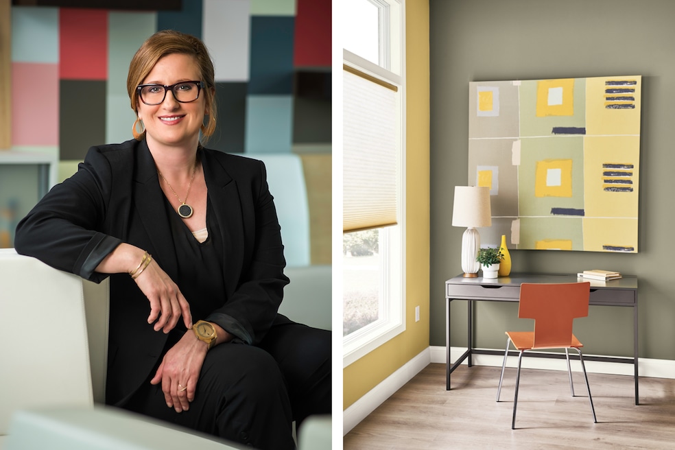
One of the real reasons that we selected khaki as our color of the year is neutrals are getting a little weightier. For instance, white has been like the top color over the last couple seasons and replaced gray as the go-to neutral. Everything is white, white, white, white, white. But when you start pairing whites with really rich colors, like deep greens, navys, deep browns, black, reds, like these richer heritage colors that have really started to come on strong, a white can look kind of boring.
Khaki is a perfect midtone neutral to pair with a red or a green. It looks really rich, very sophisticated, and it doesn't fall apart when you pair it next to these richer colors, which I think is what we're gonna see in 2026. Colors getting deeper and a little more serious. Higher contrast.
Black and white have been really popular over the last two years, whether it's in exteriors or interiors. Now we're kind of seeing it shift to, you know, we talked about earth tones and post-COVID and biophilia and all that has been a consistent trend. But how it's really showing up, people are painting laundry rooms, kitchens, cabinetry, and using deeper colors, richer, darker colors. And you don't want to just pair that with, like, a really wimpy white. You want it to have some substance, so it looks great together.
I think there's a lot of talk of nostalgia, of looking back to look forward, and that's not going to change. But how it's showing up is an intensity, like deeper, richer color.
There are so many colors of the year and color forecasts. How do you keep from oversaturating consumers?
I think it's how we frame up the conversation. Designers come back to us year over year because we've established this really nice relationship. They want to know our point of view and what's next. That's taken time.
For a consumer, probably a trend forecast is too much. So how do you differentiate? With color of the year. Because there's all the paint brands that have a color of the year. And it's not just paint brands, it's, you know, appliance companies have the same color of the year. And I think brands understand that it's fun to talk about color, but then how do you break through the noise and talk about something interesting that's going to resonate with people? So, for me, that's how the color shows up, in beautiful photography, in a great message and a great story.
That’s the challenge of a single color campaign, like "the loneliest color." Right now, we're the only one talking about that, so we kind of are enjoying this space. That makes it super fun, but also challenging because these are colors that people don't always gravitate toward. So how do you make that electric and interesting? It’s a fun challenge.