Another paint company has released its 2026 forecast, paring down its selection and opting for more pastels than its peers.
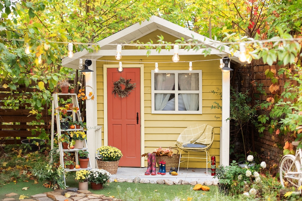
Dunn-Edwards, a Los Angeles-based paint company popular in the Southwest, put forward a palette of nine trending colors paired with eight neutral shades — a more curated offering than it has composed in years past (for 2025, the company set out 32 shades and 10 palettes as a forecast before announcing a caramel color of the year). Although Dunn-Edwards still plans to release a formal color pick for 2026, the company intentionally tightened its predictions.
The paint maker designed its “streamlined palette” — which includes a deeper blue and plum alongside six pastel tones (Eagle's View, Country Air, Gypsum Rose, Sonoma Chardonnay, Gothic Revival Green and Antique Coin) — “with usability in mind,” color marketing manager Lauren Hoferkamp explained in an email. It’s an approach that echoes sentiments in the 48-color forecast from Sherwin-Williams and the nine-tone suite Dutch Boy released: With these plug-and-play color pairings, companies can sell a ready-made aesthetic without having a customer wonder which shades complement one another in a home.

“By combining trending colors with notable neutrals, the collection provides both inspiration and practicality, making it easier to create cohesive and livable spaces,” she said.
For the coming year’s predictions, Hoferkamp said the selection team focused on colors that evoked nature, harmony and a “desire for a quiet joy” in an increasingly technology-dominated culture. She also pointed to several colors inspired by vintage design: Viridian Odyssey, a deep teal, and Gothic Revival Green, a bright color the company pulled from 19th-century design.
Although the nine colors selected highlight what Dunn-Edwards thinks is trending now, the company also arranged a palette of eight “notable neutrals,” it said in the announcement. The colors are intended to help buyers add the nine trending tones to their spaces, but neutrals serve a purpose all their own.
When it comes to home design, incorporating neutrals is like having a nutrient-rich, balanced meal, explained Mehnaz Kahn, the designer behind Your Colorful Home Interiors in New York. “You have colors in some of the rooms, and some of the rooms can be quiet,” she said. “And that’s where the neutrals would come in. The negative space is important.”
Dunn-Edwards plans to announce its centerpiece color of the year later this year, but some paint companies got the ball rolling earlier: Behr settled on a deep green and Valspar selected a eucalyptus shade.