If you spend your days in a white-walled rental or office, scrolling through “#colordrench” on social media shocks the eyes, like the soreness you get after stepping into the sunlight after hours spent inside. Your pupils contract and dilate, and suddenly, the color is everywhere.
Monochromatic squares filled with rich burgundies or plumy mauves fill the screen. Videos pan across color-saturated rooms: ones with a velvety blue from ceiling to floor, or maybe a chestnut brown painted into every available surface. One such scroller, Becky George, stumbled into the design trend while searching for change.
George and her family of five lived in a Dallas home that was “very Millennial grey,” she explained, referring to the 2010s-era affinity for steely tones and pared-back neutrals. While there was nothing wrong with the muted colors, George didn’t feel like they represented her style. Inspired by the tastes of her family and Indian culture, George said, she craved something warmer, moodier and more organic.
“For my own personal taste, I really wanted to change things up in my house,” explained George, who has a background in public health. “I wanted to incorporate more color into my life and into my home.” She was also open to experimenting: In the wake of 2020’s COVID-era lockdowns, George launched Styled by Beck, an Instagram account dedicated to budget-friendly, DIY home decor. She documented her efforts to nail down a personal home aesthetic in front of an audience topping 70,000 people seeking their own design inspiration.
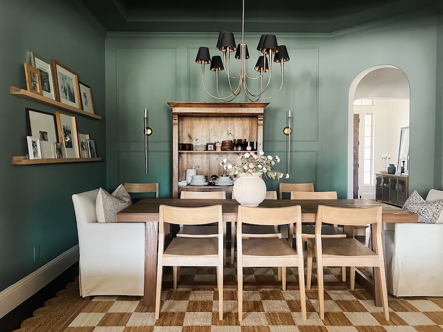
George started collecting paint swatches and samples with the initial goal of creating an accent wall in her dining room. George found herself increasingly drawn to examples of color drenching, a painting approach that floods a space with a single color, spreading it across the walls, ceiling, detailing and furniture. Depending on the color, drenching can be a statement, but George found comfort in the monochrome.

“I feel that it gives a more consistent, harmonious type of feel to the space,” she said.
So, when it came time to repaint her dining room, the accent wall became an entire room and ceiling painted an herbaceous green — Basil by Sherwin-Williams, to be exact. Instead of making the room feel smaller, George noticed that the space suddenly felt more expansive, as if color-drenching masked “where the walls really end.”
The technique also allowed for an “intimate scene” in the gathering space, George explained. “It definitely relays positive emotions,” she said. “It’s cozy. It’s inviting.”
It's also contagious. Floor-to-ceiling Basil also made its way into a powder room, where George found that it helped camouflage the space’s textured walls. Soon, one upstairs bathroom was doused in a reddish brown, and another was decked out in Benjamin Moore’s Dark Olive.
George kept the color tucked into specific rooms, keeping her hallways and larger living spaces neutral to give the eyes a respite from the deeper tones she used in the drenched spaces. Along the way, she noticed that the color offered psychological effects: The family’s laundry room also got color-drenched in a tawny brown, and George noticed that it “makes you feel more focused.”
“It is just a cohesive moment when you can actually see the world that you’ve put on the walls,” George explained. “You can enjoy it while looking at it, but then also enjoy it while being in it.”
‘The demand is there’
Although color obsession in any form is likely as old as paint, the roots of today’s color-drenching rest in the pared-back approach of midcentury design, where the rise of synthetic paints allowed for vivid color-blocking techniques. Still, the dramatic look began resurging a few years ago, as trends evolved and consumers grew bored with the gray flooring and flaxen neutrals that had become pervasive in the past two decades.
“A lot of our clients are like, ‘we don’t want the white box anymore,’” explained Letecia Ellis Haywood, founder of her eponymous interior design studio in Bellaire, Texas.
Homeowners growing tired of neutrals and embracing color also mirrors a wider aesthetic shift from “quiet luxury,” emphasizing restraint and simplicity, toward what trend forecaster Sean Monahan dubbed the “boom boom aesthetic.” Although largely associated with fashion, a “boom boom” look hinges on maximalism, an intentional display of money spent, and “a pure expression of excess," Monahan told the Guardian — all characteristics that a dramatic coat of gemstone-hued paint might signify.
As color drenching and its associated hashtags rack up thousands of social media posts, some paint manufacturers are making the most of consumers’ cravings.
In 2023, luxury paint brand Farrow & Ball launched its hyper matte “Dead Flat” line, which it said evokes an 18th-century practice of layering paint to build a depth of color, making it the “ultimate choice for color-drenching.” Due to its low-sheen — or the way the finish catches the light — the paint “dramatically minimizes light bounce, so the eye only sees color from every angle,” according to a press release from the company.
Other brands, such as Behr or Sherwin-Williams, offer suggestions on approaching the trend, pointing clients toward deep dives on mixing low-sheen walls with high-sheen detailing or capsule collections that foreground drenching-friendly jewel tones that catch the eye.
“I have had clients recently ask about [color drenching], I think because they’re seeing it more and more,” said Holly Freres, principal at the JHL Design in Portland, Oregon. JHL doesn’t design in keeping with trends, she explained, but the monochromatic approach is “here and it’s been sticking around a while.”
Part of its appeal, Freres noted, is that these bold monochrome spaces can completely transport someone, giving a “completely separate experience when you walk into a room.”
JHL recently completed a den that deploys color drenching to create an intimate blue nook within an otherwise bright residence. “It really feels adult and evening-like, and a little bit more romantic, in that room,” Freres said. “It gives a really different feeling from the other spaces in the house.”
Haywood, who founded her practice in 2021, is also seeing clients “more willing than not” to take color risks “in small doses,” she said. “It’s one room, and it’s usually rooms where they tend to entertain or where a guest would go.”
Haywood has even had luck persuading a builder to embrace the trend for the bar in a spec house, a residential typology that generally favors offering buyers a blank slate. Although hesitant initially, the builder ultimately agreed to Haywood’s vision of suffusing the small space with a mellow burgundy, she recalled, and the house ended up selling fairly quickly.
“That home is in the River Oaks area, which is a very affluent area here in Houston,” Haywood explained. “So, the demand is there.”
Material drenching comes next
Many of today’s monochromatic, color-drenched rooms have a matte finish, giving them an inherent velvetiness without the elevated cost of high-gloss paint.
Haywood sees a particular interest in matte plaster finishes, which can serve as a gateway to interest in rooms awash with dramatic colors.
“Plaster is really hot,” she said. “More people want that muted, saturated tone, so nine times out of 10 we’re doing a matte lime plaster or a Roman clay because it gives them variation and depth. And that way it doesn’t look like a flat wall.”
Haywood also helps her clients add depth to a monochromatic space by varying the paint finishes. For another bar space with detailing and built-ins, for example, a green matte wall paired with green satin shelving offers a “subtle texture change.”
Holly Freres of JHL sees some of her clients willing to go even further, embracing what she calls a kind of “material drenching.” Lately, that’s taken the form of rooms completely overtaken by wallpaper or millwork.
For a client who loved wallpaper, JHL covered every wall, ceiling, and recess of an office in a cloud-adorned option, creating a “creative and dreamy” space, Freres explained. For a client who wanted to turn a secluded room into a rarefied den that felt original to a 1905-era home, JHL applied a whiskey-stained mahogany to the walls and ceiling. The finished room “could’ve been that way for 100 years,” Freres said, but also became a space that the homeowner “could just completely unplug in.”
Will color-drenching continue?
Both Freres and Haywood see the practice of painting the walls and ceiling the same color as having staying power.
“I think people want experience and they want to have a place to go to have a different experience,” Freres explained. After eating in a bright dining space, she said, moving into a deeply colored parlor helps people “feel like they’re going to a destination.”
Haywood also sees the technique as offering clients “a little bit of escapism in their own home,” she said, predicting that while drenching will remain, the colors people favor will evolve.
“I think right now we’re in our cozy era,” she specified. Today, many people are moving away from grays and whites to favor ochres, browns, burgundies and oxbloods, she said, but the trend cycle could move on.
“Maybe a couple of years ago, white was popular, and everything was whitewashed and shiplap,” Haywood recalled. “But that was color drenching of a room, but just in a lighter color.”