When Mehnaz Khan bought her home, this room wasn’t getting much use.
“According to the builder, this was a formal living room,” said the New York-based interior designer and founder of Your Colorful Home Interiors. For her family and life, that kind of space didn’t get much use; they sat in it “maybe a handful of times a year,” she speculated.
Khan thought it would serve better as a home library, a space where one or two people could chat or where her kids could have people over and do homework. It works particularly well for the teenagers, she noted, giving them a secluded study space that isn’t quite as isolated as a bedroom.
Although she avoided making any structural changes to the space, Khan knew the kind of room she wanted: “a place where you can disconnect from the world and focus on whatever task you want to do.”
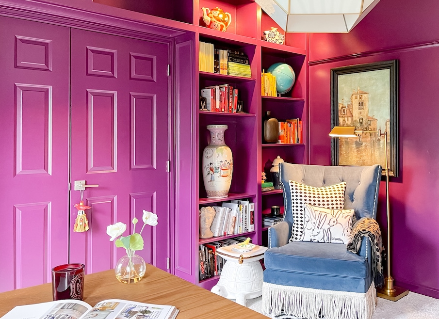
With walls in an unripened-blackberry hue and ample seating options, the finished room is cocooning, she said. “It’s really like another world.”
Here’s how Khan made the space work.
The walls are drenched in a focus-supporting color
Khan spends a lot of time thinking about how color works, focusing her practice on how hues affect a person’s emotional state. So, when it came time to select a paint for her library, she wanted a hue that encouraged “that feeling of being isolated and the emotion of really focusing on the task at hand,” she said.
That color ended up being Benjamin-Moore’s Elderberry Wine, a purple-skewed burgundy applied on the walls, door, built-ins and molding. It leans into a so-called "dark academia" color scheme, Khan noted, evoking the concept of a study-bound professor immersed in research.

By color-drenching the room, Khan created the saturated environment she craved, but she didn’t want the library to “be so closed in that you feel suffocated in there.”
So, Khan used a semi-gloss paint finish to bounce light around the space, brightening it up. Some homeowners avoid these higher-sheen finishes because they can highlight imperfections, but here the selection “turned the walls into reflective surfaces.”
All told, Khan used at least three finishes in the room, she said. The trim and baseboards are high-gloss, and the built-ins are satin — each reflecting different qualities of light and adding depth to the monochromatic walls.
Metallic threads on the ceiling capture northern exposure
Even with the depth from the different paint finishes, Khan wanted to enhance the daylight in the room while modernizing it a touch.
In “a room like this, which is north facing,” she said, “you’re not getting a lot of bright light.” What light did filter in Khan wanted to capture, so she papered the ceiling in a wallpaper shot through with metallic threads.
“I chose that on purpose, again, because I need to reflect more light in that room,” she said. A different wallpaper, perhaps a grass cloth option, “is going to absorb light that hits on it, so the room is going to be darker.”
Layered window treatments add visual interest
If given the choice of emphasizing a room’s rug or its curtains, Khan will almost always favor the latter. “Anything that is eye-level and vertical always makes a bigger difference,” she said.
For the library, she layered sheer black-and-white curtains atop bamboo Roman shades. The combination positions the Roman shades as the workhorse and protects the pricier curtain fabric (“you don’t want the oils from your hand to touch … and discolor the fabric,” Khan cautioned) and adds “more interest in the space.”
Plus, she noted, curtains offer an easy opportunity for aesthetic tweaks.
“We could change the curtains and change the look of this room,” she said.
Accent lights do the heavy lifting
Although Khan did want to brighten the north-facing library, she didn’t want to fight its natural state, so she relied on table and floor lamps to create a cozy atmosphere once the sun went down.
Each light illuminates a zone in the room, she noted, and avoids casting a severe top-down glare. The room does have a pendant fixture, but “the purpose of your chandelier is never to illuminate the entire room,” she said. Instead, it’s “the jewelry,” something more decorative than purposeful.
Color-coding books actually can serve a purpose
The library has a lot going on: the color-drenched walls, accent fabrics and shelves filled with treasures. Monochromatic walls support that assortment, Khan notes, by offering a dominant canvas for the space, even if it is a purple canvas.
But there’s another anchor woven through the shelves, Khan pointed out. “The books in this room are color-coded,” she said. “It would’ve definitely been so busy if we had used a different technique to arrange the books, and then you would find all the colors spread out.”
By penning your red, blue, and yellow spines on their own shelves, “it gives your eye those resting points,” Khan said.