Key takeaways
- Lighting and undertones matter more than you think.
- Stick to neutral, low‑sheen finishes when selling.
- Use color strategically to highlight features — not overwhelm buyers.
When selling a home, a fresh coat of paint can help wipe the slate clean to attract potential buyers.
“When you're preparing your home for sale, you're essentially relieving your own style and making room for the future homeowner to envision their own,” said Sue Kim, director of color marketing at Valspar.
When a potential homebuyer attends an open house, the paint sets the tone of the home. Darker paints make a room feel smaller or cozier. Lighter shades can make a room feel airy and big, though they may come across as cold and sterile. The goal is to create a warm and inviting area. Likewise, cooler-toned whites and grays have become less popular.
Even on a basic white wall, the undertones — warm, neutral or cool — play a major role in how a space will feel.
A single paint color can appear different throughout a house, depending on the room's lighting.
"Lighting is crucial when it comes to choosing paint color," said Hannah Yeo, senior manager of color marketing at Benjamin Moore. "The same color in one room may look different in another, and throughout the day."
Common mistakes are painting a color that is too dark, too cool or too warm. Paint chips are not 100% accurate. However, you can purchase or get a free 8-ounce sample paint to try it out on the wall before committing to a full gallon.
Color consultants evaluate light, space and use

Because lighting and undertones can impact the way color appears on a wall, experts recommend getting a color consultation before picking up a brush.
“I would come in and use the color board, walk around the house and put it beside the things that are staying, and make sure there's no weird yellow,” said Lisa Jenkins, a color consultant based in Charlotte, North Carolina.
Stagers and color consultants can evaluate the light and space to determine which colors would suit the area. The goal is to create an inviting environment.
Pro tip: Before painting, homeowners should consider switching their light bulbs because that can drastically change the feel of the room. “The most important thing, though, overall and the quickest change for success is getting the right lightbulbs in those homes,” Jenkins said. Light bulbs range from a yellow to a blue hue. Jenkins recommends 3500 Kelvin lightbulbs for a natural and neutral light.
Major paint brands Valspar, Benjamin Moore and Sherwin-Williams offer free online paint consultations through video calls, photo submissions or emails.
"During this virtual session, the consultant considers the client’s desired mood or style, along with existing elements in the home that may influence the overall aesthetic," said Hannah Yeo, senior manager of color marketing at Benjamin Moore. "After the call, clients receive three curated color options, accompanied by physical samples to view in their space."
Some paint stores will offer in-person color consults depending on the location.
Designer picks for grays
- Agreeable Gray by Sherwin-Williams (SW 7029) — Hana Latyn of Masterpiece Staging and Design
- Heritage Gray by Valspar (7007-24) — Kim
- White Heron by Sherwin-Williams (SW 7627) — Latyn
- Gray Owl by Benjamin Moore (OC-52) — Yeo
- Stonington Gray by Benjamin Moore (HC-170) — Yeo
- Wind's Breathe by Benjamin Moore (OC-24) — Jenkins
These are the best finishes
In addition to the color, a paint's finish can affect how it looks on a wall. Just like the paint color, the finish should be neutral when you are trying to sell your home. Low-sheen finishes are best for interior walls.
Flat and matte paints will not have any shine and will appear dull under light. Satin and eggshell has a low sheen so there is a hint of shine and reflection when exposed to light. A high-gloss paint will appeal to a shiny finish.
“Eggshell is the most popular finish right now — it’s low-sheen, versatile, and works beautifully across different rooms,” Kim said.
With a lower sheen, homebuyers will be able to focus on adding their own style without distraction.
“The flatter the finish, the more it hides imperfections,” Jenkins said, but “flat is not great for washability."
Eggshell- or matte-finished walls can hide imperfections, and they are durable and easy to clean.
Glossy paints make a statement, like painting a fun color on the front door. However, glossy paint typically does not look good on interior walls because it highlights imperfections more prominently.
“High-gloss finishes bring out the personality and strength of a color, but they’re more of a personal expression than a neutral backdrop for buyers,” Kim said.
If you pick a finish that is too shiny it may cause unflattering reflections when light hits it. Matte paint can appear dull at times, and it is hard to clean scuff marks off of it.
Paints will have a light-reflecting value, or LRV, that denotes how bright the paint will be on the wall. The higher the LRV, the more light is reflected and the brighter the paint will feel. Darker paints have a low LRV because light is absorbed.
For the trim and ceilings, aim for white
White trim throughout the house is best for selling; however, the hue should complement the floors. If you have warmer or ambered hardwood floors, you will want a warmer white trim to create a cohesive look.
Jenkins said a standard builder's white, which is bright and cool, up against warm-toned floors might create high contrast in color when the goal of painting is to neutralize the space.
If you are painting the walls white, then match the trim to the walls. For grays or beiges, use a white trim but ensure the undertones are complementary to each other and the floor.
Ceilings should also be painted white but with a flat finish.
“Ceilings and lightbulbs are the two things that most homeowners and real estate agents do not consider — and they are pivotal to presenting the vibe of that light, bright, warm, inviting home,” Jenkins said.
Designer picks for whites
- Atrium White by Benjamin Moore (OC-145) — Hana Latyn of Masterpiece Staging and Design
- Chantilly Lace by Benjamin Moore (OC-65) — Abigail Halal of Staged by Abigail
- Snowbound by Sherwin-Williams (SW 7004) — Latyn and Halal
- Simply White by Benjamin Moore (OC- 117) — Halal
- Decorators White by Benjamin Moore (CC-20) — Jenkins
- White Dove by Benjamin Moore (OC-17) — Jenkins
- Seapearl by Benjamin Moore (OC-19) — Jenkins
- Silver Satin by Benjamin Moore (OC-26) — Jenkins
The brick on the exterior of this home is painted Valspar's Ultra White. (Valspar)
Stay true to the home's architecture
Your paint color selection should complement the architectural features of your home.
"Embrace the original character of the home," Yeo said. "The unique architectural style of a home can serve as a beautiful foundation for expressing personal style and creating a truly personalized space."
Homes styles vary by region. A house in Florida should feel different than one in Montana. The way the home is built can serve as a guide for how it can be styled with paint.
"A Victorian home, for example, may benefit from a thoughtful mix of colors that highlight intricate moldings and trim," Yeo said. "In contrast, a contemporary home often shines with clean neutrals and intentional pops of color that enhance its sleek lines."
For new construction, white has become the standard, but a 100-year-old home painted all white might not suit its character. Painting it all white can flatten architectural details such as ornate trim.
Designer picks for beiges
- Natural Cream by Benjamin Moore (OC-14) — Jenkins
- Cream in my Coffee by Valspar (3003-10c) — Kim
- Pale Oak by Benjamin Moore (OC-20) — Yeo
- Revere Pewter by Benjamin Moore (HC-172) — Yeo
Here's when to add color
While neutral paint is considered the best practice for selling homes, adding pops of color can help a property stand out.
“While neutral tones are key, don’t be afraid to add a pop of color in a small space — like a hallway or bathroom," Kim said. "A soft sage green or muted blue can create a lasting impression and help your home stand out.”
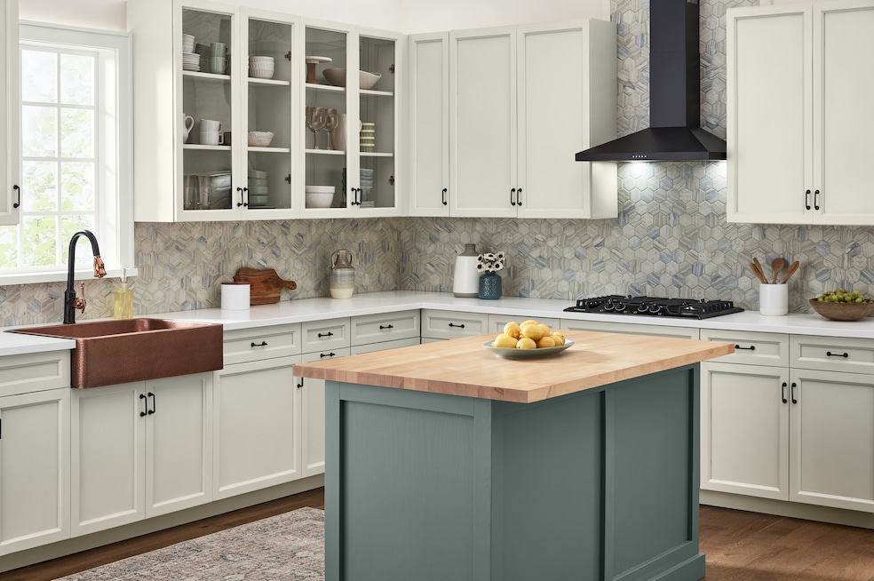
Buyers might be looking at 20 homes, and having a unique feature, such as a green kitchen island, could stand out in a positive way.
“If you want to add that memorable factor to your home, then do something that is a little unique and different — and do it with color,” said Leatrice Eiseman, executive director of the Pantone Color Institute.
Paint can be used to refresh older pieces, making them appear new.
“Painting that old chest of drawers or end table some amazing color gives it new life,” Eiseman said.
The front door is another key focal point where color can add personality and make the house memorable to buyers.
Adding an accent wall can be a risk when selling because you never know how a potential buyer will feel about the color.
Best paint recommendations for staging
Experts recommend sellers use a neutral color throughout the home. These are typically white, gray, beige or greige, which is a combination of gray and beige.
“I think that when you're doing a whole house, neutral is generally what we suggest as one color throughout,” Jenkins said.
A gallon of paint is on average $25 but can cost as high as $80 or $90 for a luxury paint. One gallon covers about 350 to 400 square feet, according to Lowe's. Painter rates are based on the size of the space and range from about $300 to $1,200 a room. The price may change based on the region of the country you are in.
Home-selling paint checklist
Before you pick a color
- Consider how to neutralize personal style so buyers can picture themselves in the home.
- Decide the overall mood you want the home to convey, such as warm or inviting.
- Identify rooms that need repainting to freshen or neutralize the space.
- Note fixed features that will remain, including flooring, cabinets and counters.
Evaluate light and undertones
- Check each room’s natural and artificial light at different times of day.
- Replace old bulbs with 3500K bulbs for a neutral, natural tone.
- Hold samples next to flooring, trim and other fixed elements.
- Look for warm, cool or neutral undertones and avoid mismatching them.
- Test 8-ounce sample paints directly on the wall instead of relying on chips.
Get expert help
- Consider a virtual color consultation from Valspar, Benjamin Moore or Sherwin-Williams.
- Ask a consultant or stager to assess undertones and lighting throughout the home.
- Compare recommended color options and test physical samples.
Choosing the right colors
- Use one neutral color throughout the home to create a cohesive look.
- Consider designer-recommended neutrals, including whites, beiges, grays or greiges.
- Avoid cool whites and grays if they make the space feel sterile.
- Make sure wall colors complement the undertones in the flooring.
- Choose colors that suit the home’s architecture and age.
Selecting the best finish
- Choose low-sheen finishes, such as matte or eggshell, for most interior walls.
- Use eggshell or matte to hide imperfections and maintain washability.
- Avoid high gloss on walls because it highlights flaws.
- Reserve high gloss for accents such as the front door or furniture.
- Use flat paint on ceilings to reduce glare.
Trim, ceilings and architectural details
- Paint trim white, selecting a warm or cool white that matches the floors.
- Match trim to the wall color if the walls are painted white.
- Keep ceilings white in a flat finish.
- Highlight historic or detailed trim with complementary colors rather than washing it out.
When and where to add color
- Keep main living areas neutral for broad buyer appeal.
- Add subtle color in smaller areas, such as a bathroom or hallway.
- Use color for memorable features, such as a painted kitchen island.
- Refresh old furniture with bold color to add charm without overwhelming buyers.
- Use a colorful front door to add personality and curb appeal.
- Consider accent walls carefully, as buyer reactions can vary.
Budgeting and planning
- Estimate paint needs (one gallon covers about 350 to 400 square feet).
- Budget $25 to $90 per gallon depending on paint quality.
- Get painting estimates ($300 to $1,200 per room, depending on the market).
- Prioritize visible or high-impact rooms if repainting the whole home isn’t possible.