For its much-anticipated color of the year announcement, Pantone Color Institute left a lot to the imagination. It settled on a blank canvas, if you will.
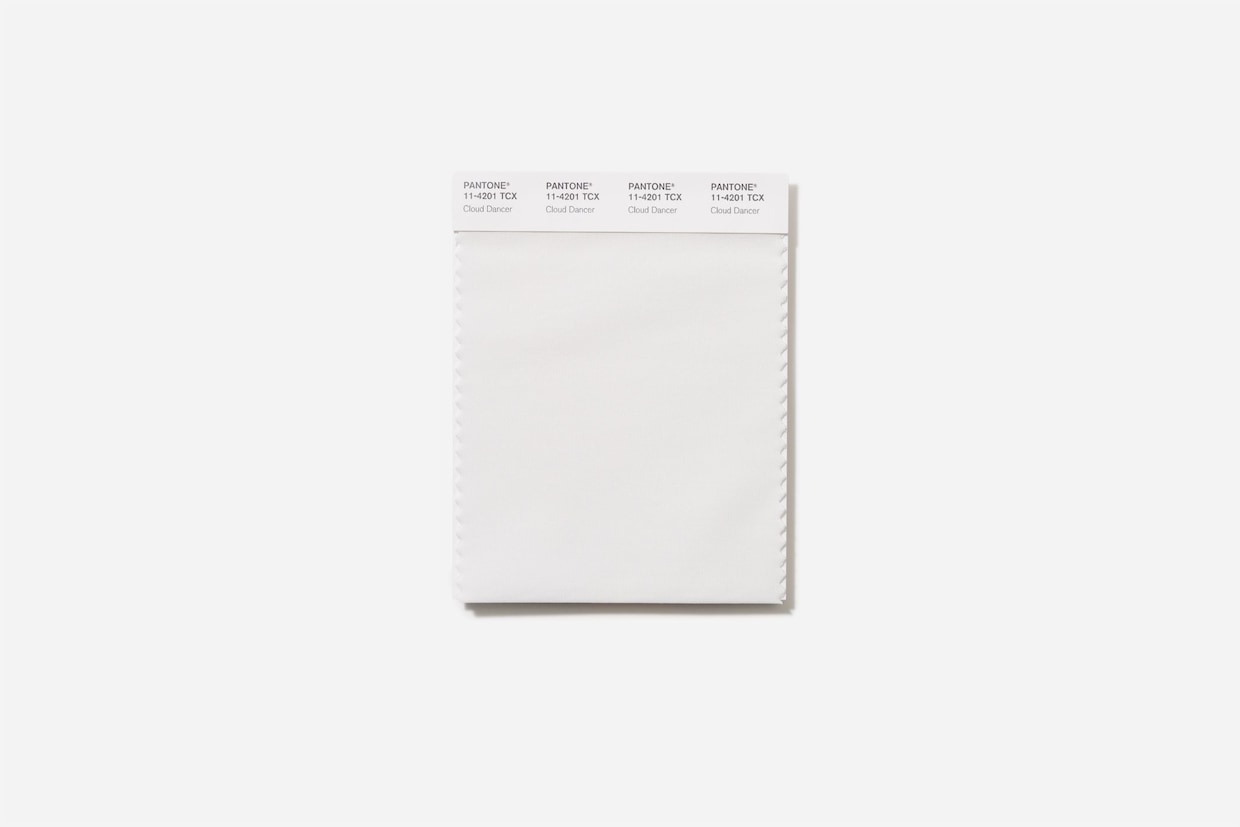
Named a magical sounding Cloud Dancer (Pantone 11-420), the hue is, simply put, white. It’s a “billowy, balanced white imbued with a feeling of serenity,” the Carlstadt, New Jersey-based color company said in a statement Thursday.
“Cloud Dancer signifies our desire for a fresh start,” it continued. “Peeling away layers of outmoded thinking, we open the door to new approaches.”
“We are living in a transitional time where people are seeking truth, possibility and a new way of living,” added Laurie Pressman, Pantone vice president. “Pantone 11-4201 Cloud Dancer is an airy white hue that exemplifies our search for balance between our digital future and our primal need for human connection, a liminal space that is a launchpad for creative expression, as individuals and communities are experimenting beyond traditional boundaries, opening the door to increased imagination and innovation.”

The company also emphasized Cloud Dancer’s “calming influence,” positing it as a visual balm for “a frenetic society rediscovering the value of measured consideration and quiet reflection.” It’s a sentiment that echoes what paint company Sherwin-Williams said of its 2026 color of the year selection, a ‘90s-inflected Universal Khaki that nudges users toward “slowing down, resetting and designing with purpose.”
Still, Pantone’s selection came as a surprise to several color fanatics, pushing some to convey their displeasure over social media. One poster called the choice a “recession indicator,” or a signal that could point to an economic downturn. Good Dye Young, a hair dye brand Paramore’s Hayley Williams co-founded, posted a simple GIF of someone rolling their eyes in disgust before turning away. Another user (@thegastonhouse) commented that they were “beyond disappointed” in the choice.
“Pantone is a color company," they wrote. "This choice shows a stunning lack of creativity and a complete disconnect from the artistic and design communities.”
Fast-food chain Applebee's took a more positive stance: “Our house-made ranch finally getting [its] flowers,” the company’s account commented.
It's Pantone’s first neutral color of the year in two decades
Pantone began its color of the year in 1999 through its Pantone Color Institute, aiming to kick off regular conversations about how color relates to our cultural landscape. According to the company, “a global team of color experts” selects the hue through sweeping trend analysis, scouring influences from film and fashion to emerging technologies and materials.
“Pantone Color of the Year is reflective of a lifestyle trend,” the company stated. “It’s about what’s happening in the zeitgeist at a macro level.”
The last time Pantone read the zeitgeist similarly? In 2006, when the company dubbed its beige “Sand Dollar” the color of the year.
Although it’s been a while since Pantone highlighted a neutral, a few other paint companies chose them as their picks for 2026. In addition to Sherwin-Williams, Dutch Boy is pushing a “Melodious Ivory.” Dunn-Edwards ultimately chose a green, but not before it hedged its bets with a color forecast heavy on light-hued pastels.